
How Should the Cart and Checkout Flow Be Designed on an E-Commerce Website?

A well-designed cart and checkout flow helps customers complete their purchase with confidence while giving businesses a clear structure for managing payments, shipping, invoicing, and orders.
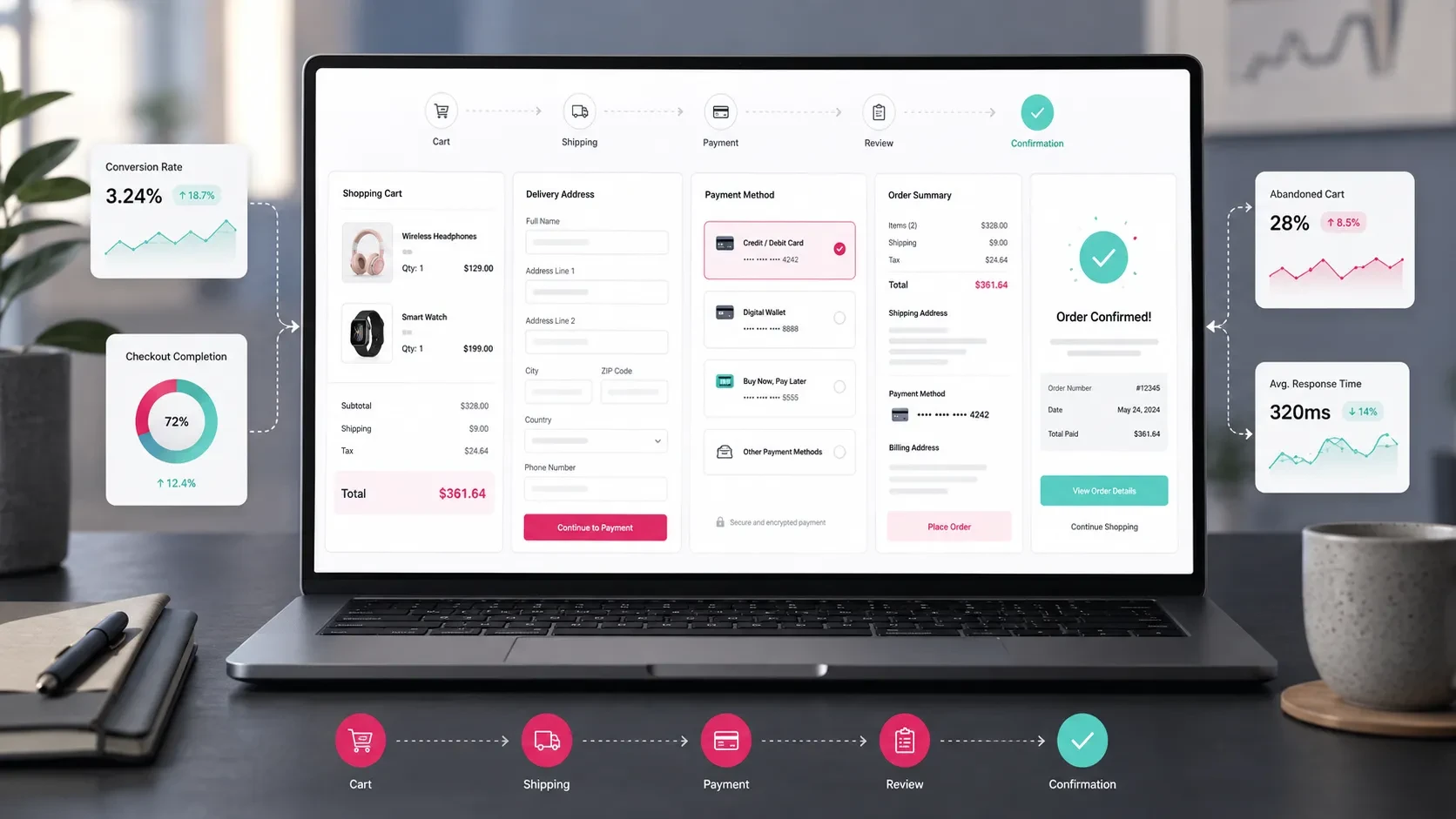
The cart and checkout flow is one of the most important stages of the e-commerce journey.
Customers explore products, compare options, add items to their cart, and eventually move toward completing the purchase. At this stage, a clear, reassuring, and efficient experience directly supports the sales process.
Checkout design involves much more than the visible interface.
Shipping options, delivery addresses, billing details, payment infrastructure, discount codes, installment options, order summaries, trust signals, error states, and analytics should all be planned together.
A strong checkout flow gives customers a sense of control. They can clearly see what they are purchasing, how much they will pay, how delivery will work, and what will happen after the order is completed.
The Cart Page Should Provide a Clear Summary
The cart page is the customer’s final review point before checkout.
Products, quantities, prices, discounts, shipping information, and the total amount should be presented in a clear and easy-to-scan structure.
A useful cart page may include:
Product name
Product image
Variant information
Quantity selector
Unit price
Total price
Discount information
Shipping information
Subtotal
Grand total
Remove-from-cart option
Continue shopping link
Proceed to checkout button
As the number of products in the cart increases, clarity becomes even more important.
Customers should be able to quickly understand what is in the cart, adjust quantities, remove products, and review the total before continuing.
The main purpose of the cart is to give users confidence that their order is correct before they move into the checkout process.
Checkout Steps Should Be Short and Easy to Understand
Customers should always understand where they are in the checkout flow and what remains before the purchase is complete.
A common checkout structure may include:
Cart Summary
Delivery Information
Billing Information
Payment
Order Confirmation
These steps can be presented as a single-page checkout or as a multi-step flow.
The right structure depends on factors such as the product catalog, customer behavior, payment infrastructure, and business model.
In a multi-step checkout, each stage should have a clear title. Customers should be able to return to previous steps, edit their information, and review the order summary throughout the journey.
In a single-page checkout, visual hierarchy becomes especially important because delivery, billing, shipping, and payment information all appear within the same interface.
Each section should remain clearly separated so the customer always knows what information is being requested.
Guest and Registered Checkout Options Should Be Evaluated
Account creation is an important part of many e-commerce experiences.
Some brands build the purchasing journey around registered customer accounts, while others also offer guest checkout to make the first purchase faster.
Registered checkout can provide benefits such as:
Access to order history
Saved addresses
Saved favorite products
Campaign and coupon benefits
Easier return and support management
A faster experience for repeat purchases
Guest checkout can also offer advantages:
Faster first-time purchases
Fewer steps before payment
A practical experience for one-time customers
The right approach depends on the brand’s sales model and customer behavior.
If repeat purchases, customer accounts, loyalty features, and personalized experiences play an important role, account-based shopping can become more valuable.
When reducing friction during the first purchase is a priority, guest checkout can provide a useful alternative.
The Delivery Address Flow Should Be Easy to Use
Entering a delivery address is a necessary step in most physical-product checkout flows.
Customers should be able to add, edit, and select addresses comfortably.
Depending on the market, an address form may include:
Full name
Phone number
City
District
Neighborhood
Full address
Postal code
Address label
Use as billing address option
Address fields should reflect the structure of the country or region where the store operates.
For an e-commerce platform focused on Türkiye, for example, a structured city, district, and neighborhood selection can make address entry more convenient.
Registered users may also benefit from an address book.
Customers can save multiple addresses, define a default delivery address, and switch between saved addresses during checkout.
On mobile devices, address forms should remain particularly simple. Fields should have comfortable touch areas, appropriate keyboard types should open automatically, and validation messages should clearly explain what needs to be corrected.
Shipping Options and Delivery Information Should Be Visible
Shipping information can influence a customer’s purchase decision.
Delivery time, shipping costs, free-shipping thresholds, and available delivery options should therefore be visible before the order is completed.
The shipping section may include:
Shipping carrier
Estimated delivery time
Shipping fee
Free-shipping threshold
Store pickup
Same-day delivery
Tracking information
Delivery notes
Shipping costs should feel like a clear part of the order total rather than an unexpected amount added at the final stage.
Customers should be able to understand how the final amount is calculated.
Shipping also needs to be connected with the operational side of the platform.
Once an order is created, shipping information should become available to the operations team, tracking numbers should be assignable to the order, and customers should receive relevant updates.
For a broader look at how these operational areas work together, you can read our guide on how to plan payment, shipping, and invoicing processes in e-commerce.
Billing Information Should Be Collected Without Adding Unnecessary Friction
Billing information is particularly important for e-commerce businesses serving both individual and corporate customers.
Customers should be able to clearly choose between individual and corporate billing options.
Relevant fields may include:
Individual invoice
Corporate invoice
Tax office
Tax number
Company name
Billing address
Same as delivery address option
These fields should appear as a clearly defined part of the checkout flow.
Customers should be able to use their delivery address as the billing address or enter a separate billing address when required.
For businesses serving repeat corporate customers, invoice information can also be stored within the customer account.
This allows returning customers to complete future purchases without entering the same company information again.
Payment Methods Should Be Presented in a Reassuring Structure
Payment is one of the most sensitive parts of the checkout journey.
The interface should communicate clarity and confidence while making available payment options easy to understand.
Depending on the business model, payment methods may include:
Credit card
Debit card
Bank transfer / EFT
Cash on delivery
Digital wallet
Installment payment
Subscription payment
Payment link
The right payment mix depends on the products, audience, and sales model.
A consumer e-commerce brand may prioritize card payments and installments.
A B2B commerce platform may also need bank transfers, account-based payment terms, or quotation-based payment flows.
Short trust messages can also support the payment experience.
Examples include:
Secure payment infrastructure
SSL-protected transaction
Your card information is processed securely
Installment options are displayed during payment
These messages should remain concise and calm.
Their purpose is to help customers understand that the payment process is being handled securely without creating unnecessary visual noise.
Discount Codes and Campaigns Should Be Positioned Carefully
Discount codes can have a significant effect on checkout behavior.
When the coupon field is too prominent, customers without a code may leave the checkout flow to search for one.
When it is difficult to find, customers who already have an active promotion may struggle to use it.
A balanced coupon experience may include:
A visible but secondary position within the cart summary
A collapsible coupon field
A clear success message when the code is applied
Automatic visibility for relevant campaigns
Helpful validation messages
Clear display of the discount within the final total
Campaign and coupon logic should also be manageable through the admin panel.
Teams may need to define:
Eligible products
Eligible categories
Campaign dates
Customer groups
Minimum order values
Usage limits
Discount type
Coupon combinations
When campaign logic and checkout presentation are planned together, promotions become easier for both customers and internal teams to manage.
The Order Summary Should Remain Accessible Throughout Checkout
Customers want to know exactly what they are buying and how the final amount is calculated.
The order summary should therefore remain accessible throughout the checkout process.
It may include:
Products
Quantities
Subtotal
Shipping fee
Discounts
Tax information
Grand total
Delivery details
Payment method
On desktop, the order summary can remain visible as a fixed or sticky panel next to the checkout form.
On mobile, a collapsible order summary may provide a more practical experience by preserving screen space while keeping the information accessible.
A clear order summary reinforces the customer’s sense of control and helps make the payment process feel more predictable.
Error Messages Should Be Clear and Helpful
Validation and payment errors are an important part of checkout UX.
When customers enter incomplete or incorrect information, the interface should clearly explain what needs to be changed.
Useful messages may include:
Please enter a valid email address.
Please check your phone number.
Please enter your complete card number.
Please complete your delivery address.
This coupon code is not available for your current cart.
Your payment could not be completed. You can try another payment method.
Messages should appear close to the relevant field whenever possible.
Customers should not have to search the page to understand what went wrong.
Payment failures should also provide a clear next action.
The customer may be able to:
Try the card again
Use another card
Select another payment method
Return to payment options
Contact support
A helpful error experience makes it easier for customers to continue rather than abandoning the purchase completely.
The Order Confirmation Screen Should Complete the Experience
Once payment is completed, the customer should see a clear order confirmation screen.
This screen closes the purchasing journey and reassures the customer that the order has been successfully received.
It may include:
Order number
Order summary
Payment status
Delivery address
Estimated delivery information
Shipping process information
Email confirmation notice
Link to the customer account
Continue shopping link
The page should also explain what happens next.
For example:
“Your order has been received. We’ll send updates about the delivery process by email.”
This simple explanation gives customers a clear expectation after payment.
A confirmation email can then provide the same essential information and give customers a reference they can access later.
The Admin Panel Should Support the Order Flow
Customers interact with the cart and checkout experience, while company teams manage the resulting orders through the operational side of the platform.
The checkout architecture should therefore be planned together with the admin panel.
Useful order management areas may include:
Order list
Order details
Payment status
Shipping status
Billing information
Customer information
Product details
Discount information
Internal order notes
Cancellation and return management
Notification history
As order volume and catalog size increase, the quality of this operational experience becomes increasingly important.
Teams should be able to identify orders requiring attention, update statuses, manage shipping, and review payment information without moving through unnecessary screens.
For a broader look at the complete e-commerce project structure, you can read our guide on which processes should be planned when building an e-commerce website.
Conversion Tracking Should Be Built Into the Checkout
The cart and checkout journey is one of the most valuable areas of an e-commerce website for analytics.
Teams should understand how users progress through each stage, where they leave the process, and which campaigns ultimately lead to purchases.
Relevant events may include:
Product view
Add to cart
View cart
Begin checkout
Add shipping information
Add payment information
Purchase
Apply coupon
Payment error
Order confirmation
These events help teams identify where the experience performs well and where improvements may be useful.
For example, analytics can reveal:
Which devices have higher checkout abandonment
Which payment methods are used most frequently
Which campaigns generate more purchases
Where users leave the checkout flow
Whether certain shipping costs affect conversion
How coupon usage relates to completed orders
When the measurement structure is defined during the project, checkout can continue to improve after launch based on real customer behavior.
Mobile Checkout Should Be a Priority
A large share of e-commerce journeys take place entirely on mobile devices.
Customers may discover the product, compare options, add items to their cart, and complete payment without ever moving to desktop.
The mobile checkout experience should therefore be planned as a primary experience.
Important areas include:
Large, comfortable touch targets
Single-column forms
Short and clear field labels
Collapsible order summary
Easy address selection
Appropriate mobile keyboard types
Sticky payment or continue button
Fast page loading
Clear error messages
A reassuring payment interface
Customers should be able to move comfortably between delivery information, payment fields, and the order summary.
The number of unnecessary taps and repeated inputs should be kept low.
A focused mobile checkout creates a smoother purchasing experience and supports conversion across the devices customers use most frequently.
Codezone’s Approach
At Codezone, we plan e-commerce cart and checkout flows together with user experience, payment infrastructure, shipping, invoicing, admin operations, integrations, and conversion tracking.
We begin by understanding the product structure, payment methods, delivery requirements, billing needs, and operational workflows.
From there, we structure the cart, address, shipping, payment, and order management stages as one connected system for both customers and internal teams.
This approach creates an e-commerce experience where customers can complete purchases comfortably, teams can manage orders through a clear operational structure, and the entire sales journey can be measured and improved over time.
Conclusion
The cart and checkout flow should bring together user experience, trust, shipping, billing, payment methods, order management, and analytics.
A clear cart summary, simple checkout stages, transparent shipping information, easy address management, reassuring payment experience, and visible order confirmation all support the customer’s purchasing journey.
The operational side is equally important.
When payment, shipping, invoicing, and order management work within the same structured flow, teams can manage commerce operations more efficiently.
A well-designed checkout therefore creates value on both sides of the e-commerce experience: customers can purchase with greater confidence, while businesses gain a clearer and more measurable order-management process.
Frequently Asked Questions
What should be included on an e-commerce cart page?
A cart page can include the product name, image, variation, quantity, price, discounts, shipping information, subtotal, grand total, and a clear button to proceed to checkout.
How many steps should an e-commerce checkout have?
A typical checkout may include cart summary, delivery information, billing information, payment, and order confirmation. Depending on the business model, these can be presented within a single page or as a multi-step flow.
Should an e-commerce website offer guest checkout?
It depends on the sales model. Guest checkout can support a faster first purchase, while registered accounts are useful for repeat purchases, saved addresses, order history, returns, and customer-specific benefits.
How can trust be increased during the payment step?
A secure payment infrastructure, SSL protection, a clear order summary, transparent shipping information, helpful error messages, and visible support options can all strengthen confidence during payment.
Which checkout conversions should be tracked?
Add to cart, view cart, begin checkout, add shipping information, add payment information, purchase, coupon usage, payment errors, and order confirmation are useful events to track.