
How Should the Hero Section of a Corporate Website Be Structured?

The hero section of a corporate website should help visitors understand the brand, recognize its value, and move toward the right next step through clear messaging, CTAs, visuals, and trust signals.
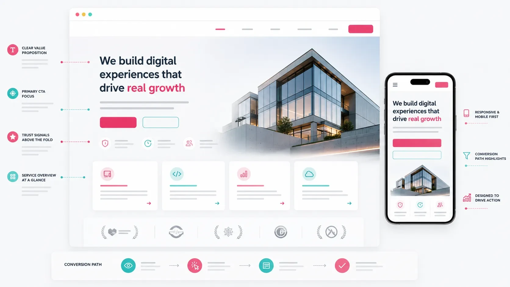
The hero section is one of the first digital touchpoints between a visitor and a corporate brand.
When someone arrives on the website, they usually want to understand within a few seconds what the company does, who it serves, and where they should go next.
This area typically includes the main headline, a short supporting description, call-to-action buttons, visual direction, initial trust signals, and the first transition into the rest of the page.
When the hero section is structured well, visitors can move through the website more comfortably. They can explore services, continue to a relevant page, reach a quote request form, or learn more about the company.
For this reason, the hero should not be treated only as a visually impressive opening section.
Brand messaging, user experience, and conversion goals should all be planned together.
The Main Message Should Be Clear at a Glance
The primary responsibility of the hero section is to communicate the brand’s main message clearly.
Visitors should be able to understand what the company does and what kind of value it can provide without having to search through the rest of the page.
A strong main message should help answer questions such as:
What does the company do?
Who does it work with?
What need does it address?
Why should the visitor continue exploring?
What should the visitor do next?
Corporate website headlines should avoid language that could apply to almost any company.
Broad statements such as “We deliver quality solutions” provide very little context.
Instead, the headline should reflect the company’s actual services, expertise, or value.
For example, a software company can communicate more clearly by referencing concrete areas such as corporate websites, e-commerce, mobile applications, or digital product development rather than opening with a generic phrase such as “Digital solutions.”
The headline, supporting description, and CTA should work toward the same goal.
The headline attracts attention, the description provides context, and the CTA guides the visitor toward the next action.
The Target Audience and Value Proposition Should Be Clear
The hero section should communicate not only what the company does but also who the service is designed for.
When visitors can recognize themselves in the message, they can determine more quickly whether the company is relevant to their needs.
A corporate website service, for example, may be relevant to:
Companies planning to redesign their website
Teams launching a new brand or business
B2B companies that want to explain their services more clearly
Businesses looking to generate more customer inquiries
Brands that want to manage website content internally
Companies looking to strengthen SEO and performance
Which of these audiences receives the strongest emphasis will directly influence the hero message.
The value proposition should also be concrete.
The visitor should be able to understand what the website or service can help them achieve.
This value may include:
Clearer brand communication
Stronger service presentation
Easier content management
Better website performance
More qualified project inquiries
A more sustainable technical foundation
The hero should create a sense that the company understands the visitor’s needs and can provide a relevant solution.
When that connection is established, visitors are more likely to continue through the page and eventually get in touch.
The CTA Should Define the Next Step
A CTA is one of the primary elements that directs visitors from the hero section toward the next step.
Its wording should match the brand’s communication style and clearly explain what will happen when the visitor clicks.
Possible CTA labels include:
Tell Us About Your Project
Request a Quote
Explore Our Services
Schedule a Meeting
Let’s Plan Your Website
For project-focused companies such as Codezone, “Tell Us About Your Project” can create a strong and natural starting point.
Rather than framing the action as simply filling out a form, it invites the visitor to begin a conversation about their project.
In most hero sections, one primary CTA and one supporting CTA are enough.
The primary CTA can lead directly to contact or a quote request, while the secondary CTA can guide visitors toward services, the working process, or selected projects.
When designing CTA areas:
Button copy should be concise and easy to understand.
The primary CTA should have stronger visual priority.
The secondary CTA should remain more subtle.
Buttons should be easy to tap on mobile devices.
CTA destinations should match the rest of the page journey.
For a more detailed look at the next step after the CTA, you can read our guide on how to structure a quote request form on a corporate website.
Visual Direction Should Support the Brand Message
Photography, illustrations, interface mockups, video, or other visual elements in the hero should reinforce what the brand is trying to communicate.
The visual should not function simply as decoration.
Depending on the company, the hero may use:
Interface visuals that represent the product or service
Editorial imagery that communicates how the company works
Premium photography relevant to the industry
Website or dashboard mockups
Abstract compositions aligned with the brand language
Simple scenes that communicate the customer experience
For software, technology, and digital product companies, interface-oriented visuals can be particularly effective because they make the type of work more tangible.
For other corporate service brands, visuals may focus more on trust, expertise, structure, and the working process.
The visual direction should also reflect the company’s actual services.
If the company develops corporate websites, a composition suggesting website interfaces, content structures, CMS management, performance, or user journeys may provide more context than a generic technology image.
Color, contrast, spacing, and composition also influence how the hero is perceived.
A premium experience generally benefits from a balanced visual structure that supports the message instead of competing with it.
Trust Signals Should Appear Close to the Hero
Visitors are evaluating trust from the moment they arrive on the website.
Trust is not created only through client logos.
Process clarity, team information, expertise, technologies, references, and a professional communication style all contribute to the overall perception.
Trust signals near the hero may include:
Industries served
Number of completed projects
Areas of expertise
Technologies used
Selected projects
Customer testimonials
Process stages
Post-launch support
Team information
Clear contact channels
Not all of these elements need to be placed directly inside the hero.
A short trust band, service cards, or key capability areas immediately below the first screen can provide a more balanced structure.
For example, the company’s main service areas — corporate websites, e-commerce, mobile applications, and digital products — can be introduced through concise cards after the hero.
This allows visitors to understand the broader scope of the company and continue naturally toward the service that matters to them.
Trust signals are strongest when they are based on concrete information rather than exaggerated claims.
Visitors should be able to understand what the company does, how it works, and where its expertise lies.
Mobile Hero Design Should Be Planned Separately
A hero section that works well on desktop does not automatically create the same experience on mobile.
Mobile users encounter the headline, description, CTA, and visuals within a much narrower space.
Priorities therefore need to be adjusted carefully.
On mobile:
The headline should remain concise and readable.
Supporting copy should avoid unnecessary length.
The primary CTA should be easy to reach.
Visuals should not overpower the message.
Navigation should remain simple.
The page should load quickly.
The first screen should not feel overcrowded.
The layout should naturally encourage scrolling.
The goal is to give mobile visitors a fast decision-making environment.
They should quickly understand what the company does and be able to reach the relevant service or contact step with minimal effort.
This becomes particularly important for corporate websites receiving paid advertising traffic.
Visitors arriving through campaigns often evaluate the page quickly and may be ready to take action immediately.
For this reason, mobile hero design should prioritize speed, readability, and CTA accessibility.
Different image crops, shorter descriptions, or simplified visual compositions may be used for smaller screens.
This creates a mobile-specific experience rather than a desktop design that has simply been reduced in size.
The Hero Should Lead Naturally Into the Rest of the Page
Even a strong hero section needs to work together with the rest of the website.
Once visitors understand the main message, the following sections should help them evaluate services, trust signals, process, work examples, and contact options in a natural sequence.
A page flow may look like this:
Hero: main message and CTA
Services: what does the company offer?
Trust signals: why this team?
Process: how does the work progress?
Selected work: what has the company created?
Content or insights: how is expertise demonstrated?
CTA: contact or quote request
This creates a structured journey.
The hero introduces the value proposition, while the remaining sections provide the information needed to support the visitor’s decision.
To generate more customer inquiries through a corporate website, the hero, service pages, and quote request flow should be treated as parts of the same conversion journey.
Visitors should be able to move naturally from the main message to service details, from service details to trust, and from trust toward contact.
For a broader look at this structure, you can read our guide on how to generate more customer inquiries through a corporate website.
The Hero Should Be Measured and Improved
Once the website is live, hero performance should be monitored over time.
Teams can measure which CTAs receive more clicks, whether users continue scrolling, how mobile and desktop visitors behave differently, and which traffic sources generate stronger conversions.
Useful metrics may include:
Hero impressions
CTA clicks
Visits to service pages
Visits to the quote request form
Scroll depth
Mobile and desktop behavior
Advertising campaign performance
Organic traffic behavior
Form submissions
WhatsApp or phone clicks
These insights can guide future improvements.
The headline, supporting copy, CTA wording, visual direction, or the flow into the next section can all be refined based on actual user behavior.
Measurement turns the website from a static presentation into an evolving digital touchpoint.
The hero section is one of the most important areas in that optimization process.
For a broader look at SEO, performance, and technical measurement, you can read our guide on how to develop an SEO-friendly corporate website.
Codezone’s Approach
At Codezone, we plan corporate website hero sections by considering brand messaging, target audiences, user journeys, CTA structure, visual direction, mobile experience, performance, and measurement together.
We begin by understanding what the company offers, who it wants to reach, which actions visitors should take, and what business goals the website needs to support.
From there, we structure the headline, supporting description, CTAs, visual composition, and transitions into the rest of the page within the same experience.
This turns the hero section into a strategic starting point that explains the brand clearly, guides visitors toward relevant actions, and strengthens the website as a customer touchpoint.
Conclusion
The hero section of a corporate website should be planned around brand messaging, target audiences, value proposition, CTAs, visual direction, trust signals, mobile experience, and measurement.
When visitors arrive, they should quickly understand what the company does, recognize the value relevant to them, and know where to go next.
The hero is therefore more than the visual opening of the website.
It is the starting point of the user journey.
When structured effectively, it helps make the corporate website clearer, more directional, and more valuable as a digital customer touchpoint.
Frequently Asked Questions
What is the hero section of a corporate website?
The hero section is the first area users see when they arrive on a website. It usually includes the primary headline, supporting copy, CTA buttons, a visual area, and selected trust signals.
What information should be included in the hero section?
Visitors should be able to understand what the company does, who it serves, what value it provides, and which action they can take next.
How many CTAs should a hero section include?
In most cases, one primary CTA and one supporting CTA are enough. The main CTA can lead toward contact or a quote request, while the secondary CTA can direct visitors toward services, process information, or selected work.
How should a hero section be designed for mobile?
The headline should remain concise, supporting copy should be easy to scan, the CTA should be clearly visible, and the visual composition should remain balanced. Users should be able to understand the page quickly and continue to the next step comfortably.
How can hero section performance be measured?
CTA clicks, scroll depth, visits to service pages, quote request form transitions, mobile behavior, campaign performance, and conversion data can all be used to evaluate hero performance.